
Let’s talk color & branding. This blog is aimed directly towards those starting out in business or rebranding.

At first look, colors may not seem that important. However, they are extremely important to your business! No matter what colors you choose for your logo and brand, there will be certain psychological perceptions of them. In other words, it’s called color psychology. You can read more here: https://en.wikipedia.org/wiki/Color_psychology
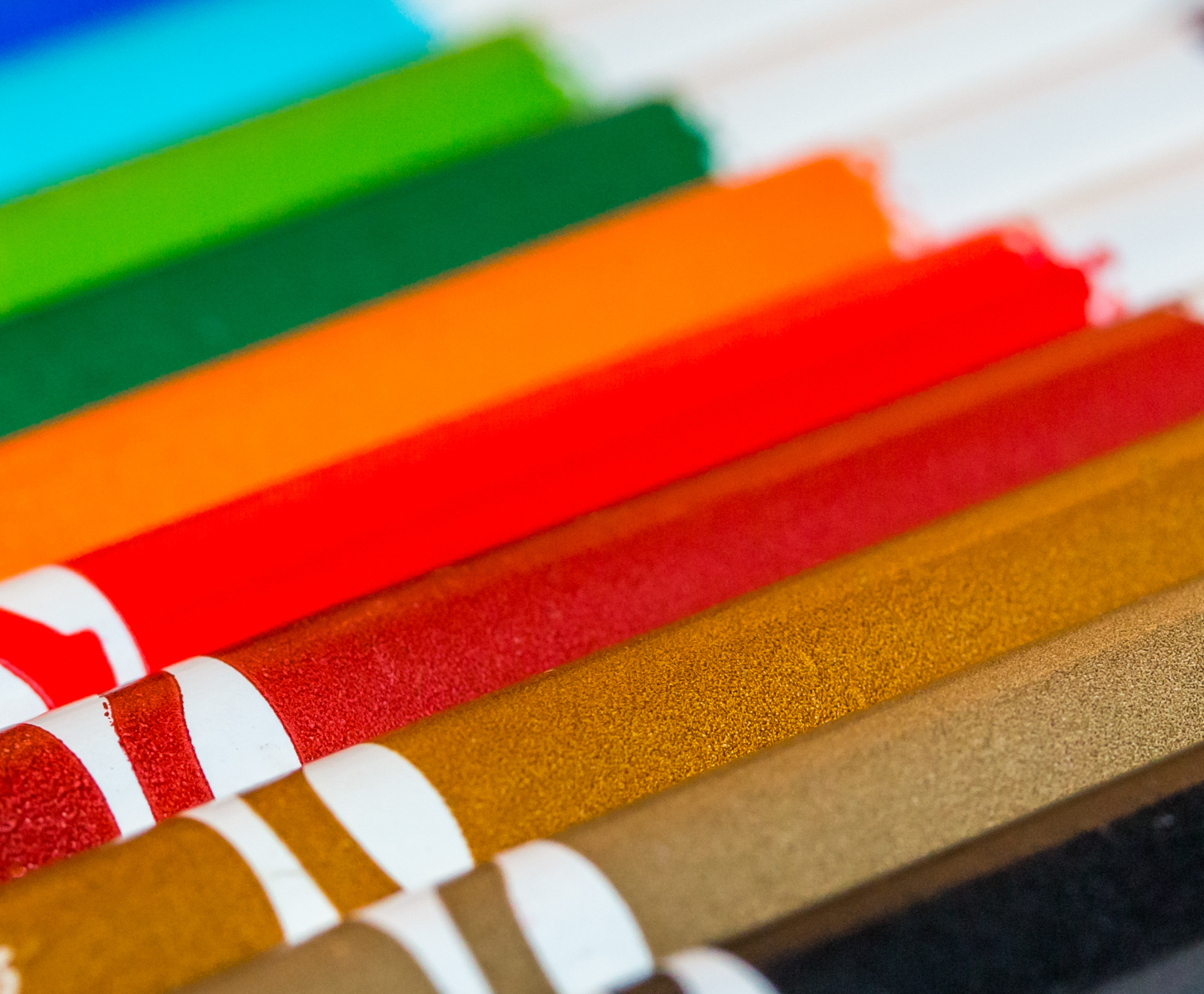
We’ll break down a few widely used colors, as well as some that are uncommon. Let’s talk color & branding a bit more in depth.
Red
Few colors evoke a psychological response more than red. Red is love, it is fiery, passionate, angry, exciting, and quickly catches attention. With this in mind, it’s good to know what other colors to couple it with. We’ll use black and white as examples. It also depends on which shades of red you are using.
Red and white can present itself as exciting and clean. Or, perhaps evoke passion and health.
Red and black are two power colors. Therefore, they are to be used cautiously. There’s a lot of aggression when combining these two colors. So, it makes sense to choose your shade of red wisely when combining it with black. Red and black, albeit a pretty cool color combo, reminds us of the Empire in Star Wars or even the Nazi swastika. So be careful! What do you think of for a black and red logo?
Other shades of red convey different emotions. Maroon is strong and brave. Burgundy is sophisticated or subtle. On the other hand, bright red is energetic and exciting. Whatever red you choose, certainly make sure it’s not too overpowering with the complementary color.
Blue
Ah, blue! This writer’s favorite color. Calm, trusting, confident, and the association with water. However, as I have shown above, there’s still negative aspects associated with blue. These would be cold and distant. At the same time, think of the term having the “blues,” you certainly don’t want to give off that impression!
Blue and white evokes dependability and innocence. A blue and white logo, if designed correctly, would exude a feeling of tranquility and purity as well. As long as the graphic designer is aware of their color choices and the overall layout, these color combos could be great for business. Think Lowes, Ford, or American Express.
Blue and black is trust and sophistication. Of course this depends on the type of blue used. For example, BMW and its use of blue and black works well.
Some alternate light blue colors give off a sense of faith, health, or stability. Darker blue hues represent feelings of security, masculinity, or trust.
Green
When you initially think green, what do you think of? If you answered money, environment, or nature you’d be correct. In addition, green is used for brands like John Deere, Land Rover, and Whole Foods. Businesses in the environmental, landscaping, and restaurant industries regularly use green colors.
Green and white makes for a harmonious and clean feeling. Pending the shade of green and the design shape used, it could represent natural purity. At this point, we’ll also add that the complete design, font or typeface choices, all combined will lead to very specific emotional responses. It’s important to realize that the complete design combination is what truly leaves a viewer feeling a certain way, not just the color choice.
Green and black are growth and elegance. Black can be an edgy color to use with greens. You’d want to go with black likely as a complement to whatever green you choose.
Light greens like spring green or chartreuse give off feelings of freshness or spring time. By comparison, darker greens are associated with maturity and growth.
Other Choices
Gray. Gray is used in branding mainly as a secondary color. In addition, it’s a great way to tone down other bolder colors. Gray is subtle, steady, and controlled. Use gray sparingly to avoid unwanted feelings of isolation or depression.
Purple is next on the list. The color purple leaves us feeling creative and/or curious . Purple is also often associated with mystery. It’s the color of royalty as well. Lighter purples are romantic and spiritual. As I have said with other colors, there are consequences with each. Darker tones of purple, if used unwisely, present themselves as sad or frustrating.
Finally, brown. This color is earthly and dependable. Brown also evokes neutrality, boredom, and emptiness. So be careful! You do not want your logo or company brand to be boring or drab. Look for ways to make brown stand out if you choose this color. M&M’s, UPS, and A&W Root Beer have found successful ways to utilize brown.
Need help brainstorming a new logo and branding color palette? Let’s talk color & branding! You know how to find us!

Analyze. Create. Achieve.