Looking at the Marmite of the typeface world.
by Thomas Payne
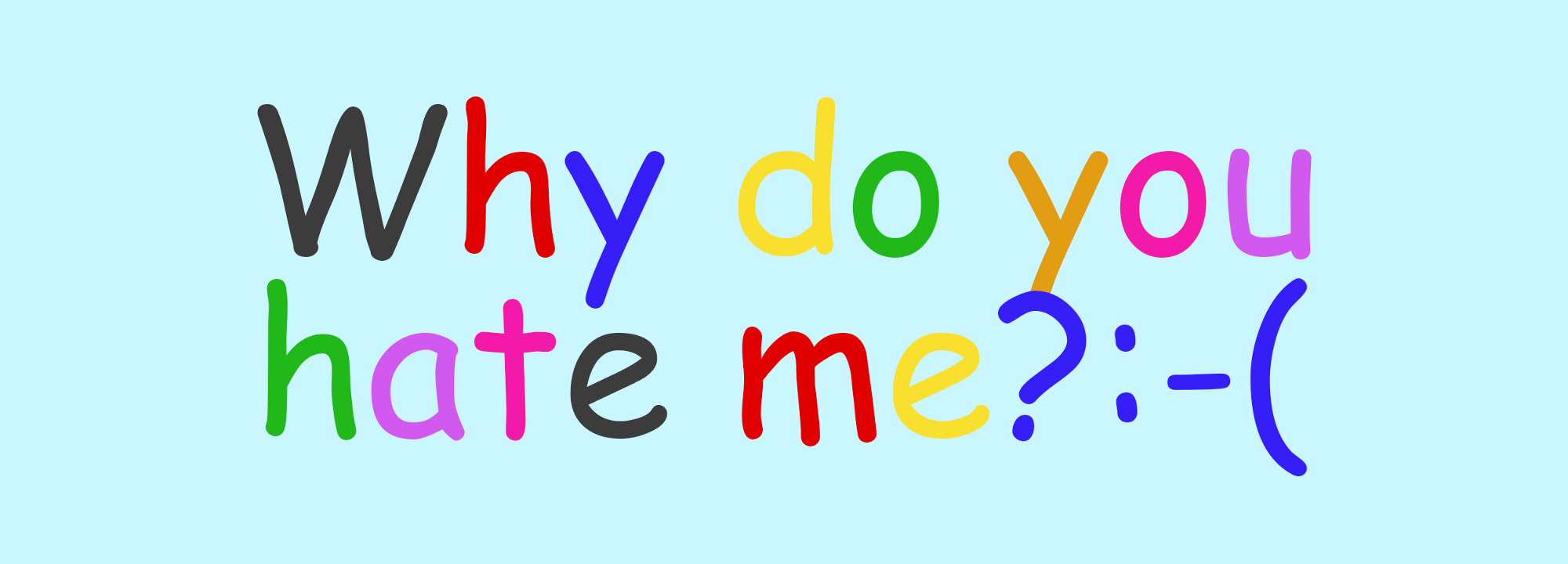
The font everyone loves to hate
Things I hate: people driving closely behind me, noisy eaters, spam email, minimalist hipster posters (another rant/article in the works), automated phone systems and Love Island.
You’ll notice that as well as many other things, Comic Sans isn’t on that list.
In an interview for the Huffington Post, Vincent Connare, designer of Comic Sans, said, “if you love Comic Sans, you don’t know anything about typography. But if you hate Comic Sans, then you don’t know anything about typography either…and you should get another hobby”.
His statement was published in response to an online campaign called ‘Ban Comic Sans’, the brainchild of husband-and-wife graphic designers, Dave and Holly Combs. The life mission of these typographic vigilantes is to abolish the use of the world’s most ubiquitous and reviled — and arguably misunderstood — typeface, Comic Sans.
“Comic Sans is a blight on the landscape of typography.”
– Dave Combs of Ban Comic Sans
Power to the people
How did Comic Sans come into existence? 1995 saw the release of Microsoft Bob, software that acted as a user-friendly interface to introduce younger users to the Microsoft operating systems of the time. The virtual guide for using the OS was a dog named Rover, who gave advice via dismissable speech bubbles, just like Microsoft’s anthropomorphic paper clip — remember him?
Well, Connare was surprised to see that in beta versions of Microsoft Bob, Rover ‘talked’ in the formal Times New Roman: “I thought, ‘That’s silly. Dogs don’t talk like that.’ So I said it would look better if it looked like a comic book.”
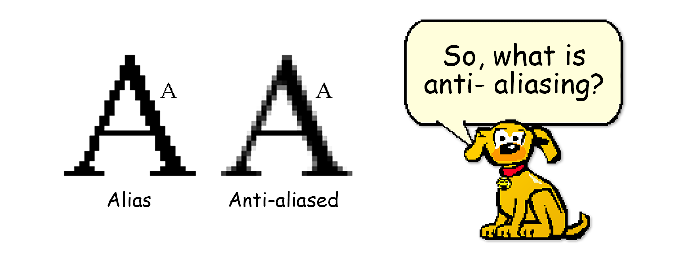
Drawing on the lettering style of comic books including The Dark Knight and Watchmen, Connare drafted a typeface without anti-aliasing for PC screens. It had personality, unusual letter spacing and unequal visual weight. And it communicated a playful, friendly and informal aspect to whatever Rover explained to you.
Microsoft Bob ultimately didn’t use Comic Sans, but the typeface spread far and wide. Microsoft released Windows 95 with five supplied fonts, in various weights: Arial, Courier New, Times New Roman, Wingdings and… Comic Sans.
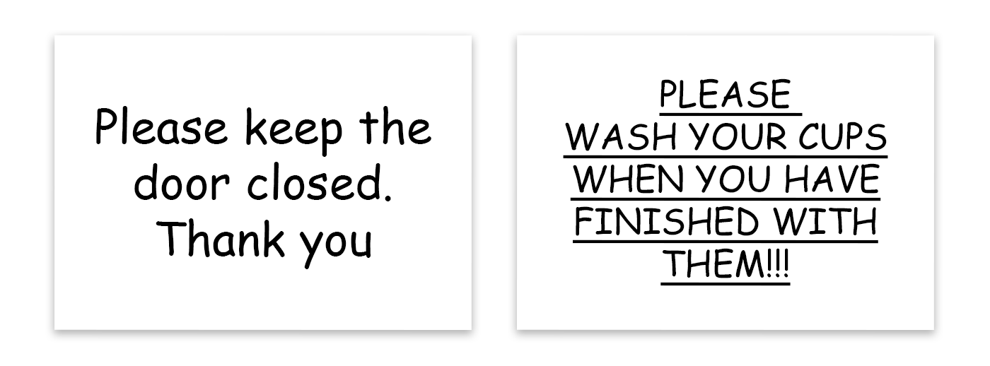
On top of this, Comic Sans was a default font for Microsoft Publisher, the entry-level desktop publishing software. This gave people worldwide the ability to design their own marketing and company branding materials, not to mention as many passive aggressive office signs as any situation demands.
Typographic misuse — a matter of opinion
Fonts are letters in different shoes. You may think it’s distasteful to wear Crocs with socks, or even to wear Crocs at all. I may not. And you’ll probably wear dress shoes rather than Crocs to a wedding, and trainers instead of Crocs for sports. It’s all about purpose and context.
Designers spend hours of their lives scrolling through Font Book trying to select the right typeface for the job. Sometimes it can be an easy choice, but other times it’s not so simple. Making the correct typographic choice should be based on several questions:
- What message are you trying to convey?
- Who are the intended readers?
- Who or what does the text represent?
- In what context will the typeface be seen?
Not everyone who is choosing a typeface or designing a poster may consciously ask themselves these questions, but some will without realising it.
Well, critics of Comic Sans argue that it shouldn’t be used in the workplace or on an outdoor defibrillator cabinet. But what font would you suggest for signage in a paediatrician’s waiting room? How about for labels of emergency equipment in a school? How can you make a sign that says “please keep the office toilet tidy” without coming across as being passive aggressive? Comic Sans could be your solution.
Comic Sans rules KO
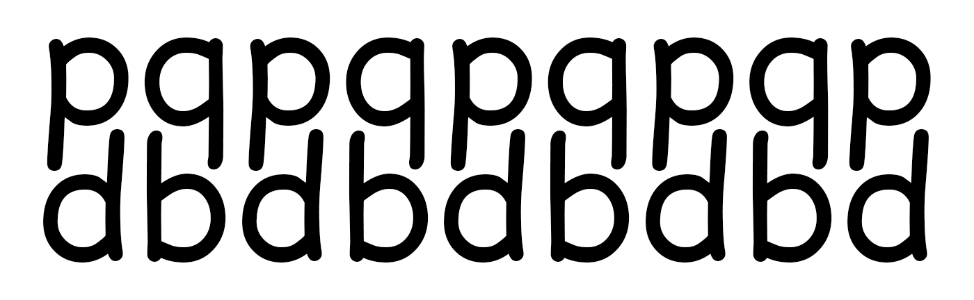
There are practical applications for Comic Sans too. Dyslexia is a disability as defined in the Equality Act 2010. 10% of the population are dyslexic; 4% have severe dyslexia. Some fonts have been specifically designed to aid dyslexics, but if you don’t have access to those, Comic Sans is one of the most popular alternatives. Its letter spacing and legibility tick the right boxes for dyslexic readers, with one exception. The mirrored lowercase ‘b’ and ‘d’ can be easily confusing for a dyslexic reader.
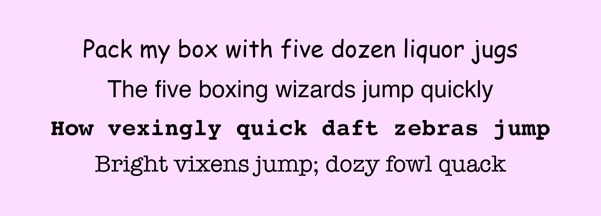
Compare Comic Sans with a selection of other fonts by reading the pangrams below out loud, and consider why people may have chosen it as the font for their design project. Maybe they intended the message to be affable, casual or just wanted disabled or young people to read the text with ease.
Comi-clusion
Do you know your ascenders from your descenders, kerning from tracking or your ear from your terminal? If you want to learn more, visit Supremo’s Type Terms Explained — it might just convince you Vincent Connare knew what he was doing.
Designers often have conversations about type and its uses with respect to whether those who drafted a piece of work chose the right typeface, and how the choice works with brand colours.
Some fonts are more ubiquitous than others, and easier to identify. When you next spot Comic Sans, take a few moments to consider the possible reasons it was chosen.
And when you choose your next font, use whatever you think is best. If you think it feels right, use Comic Sans. Or, wear your Crocs to a wedding.
Thomas is a Senior Designer for Caliber, sign painter and typographer. Find out what Caliber does or have a look at Thomas’ painting.