
Task:
Design a year around logo for a place typically viewed as a winter resort.
Process:
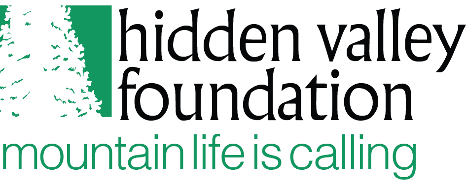
The initial meetings brought about the notion of “Mountain Life is Calling”. Conveying the ideals and experience of a four season active family community while staying true to the company’s preexisting branding.
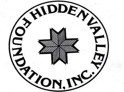
Originally the foundation used a stylized snowflake and lettering to reflect the name. The logo spoke only of the winter season and was beginning to showing its age. It did not tell the story of an active four seasons community, nor did it convey the idea of “Mountain Life Calling”. Our task require us to develop a logo that would tell the story of a four seasons community, give a sense of mountain life, and be one that the organization could used in all its products, collateral, website and social network profiles.
Once an initial idea began to take shape, we moved into the nuts and bolts of graphic design work. Fonts were tested, thicknesses determined, elements arranged until, for lack of a better phrase, it just felt right. Now, instead of just a symbol of a season, a vibrant year-round community was established.
![]()
![]()
Final polish added local elements of rolling mountains, sunrise, water and trees to show the full force of the seasons and marry the notions to the new brand.
![]()
![]()
![]()
Simply put, this case study is to show that a logo is not just a pretty picture. It is vital representation of your company only derived from meticulous research, deep analysis and a thorough investigation of existing products within your sphere.
Our designers know this, do yours?
How Can We Help YOU Today?
Inspire. Create. Print.