
As a marketing firm dedicated to helping business owners succeed, we wanted to create an informative blog based on how the public may perceive what you are putting out to them. This blog article will deal specifically with the marketable color of your business. You may ask yourself, “what does the color of my business have to do with anything, and what is it?”
Well, frankly, it’s the persona you present to the public through the color scheme choices on any of your marketing materials AND it has a LOT to do with your image. Color dictates how potential customers feel, react, and associate with your business upon seeing your logo, website, social media pages, or other materials. There’s a lot of psychological mumbo jumbo to it and plenty of research studies have been done on the topic. Don’t believe us? Google it yourself and see.
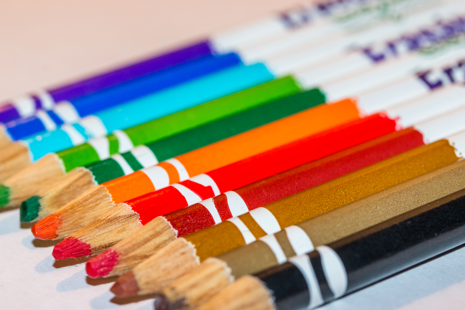
Lets take a quick look at some examples of color as well as the positive and negative emotion/image they present:
Red: Red colors often evoke passion, power, love, speed, energy, and if used correctly can create a strong subliminal call to action. The color red can also induce feelings of anger, increased heart rate, anxiety, warning, and aggressiveness. Other things we notice as we march through life and look around us, is that our brains pick up that red is almost always associated with sex, incorrect test answers, and domination.
Blue: Blue is often the favorite choice of color by many people in studies. There are many positives, but also a few negatives with blue. Blue is one of the safest colors to use in business as it represents honesty, relaxation, calmness, spirituality, and peace. On the opposite side of the spectrum, blue can also trigger depression, frigidity, sadness, and superstition. Think of blue skies, the blue sea, winter, water, and openness to better understand how blue works.
Green: What do you immediately relate to the color green? Yep…environment! Green is associated with growth, nature, admiration, vitality, and harmony. The color green if used too much can also lead to feelings of greed (think money here), fear, apprehension, envy, and materialism. Green is a great choice for businesses relating to science and nature, as long as its not overused.
Black: Oh, black, you mysterious classy gentleman of leisure! Black creates a huge range of emotion when used in business. It can create an aura of secrecy, authority, sophistication, strength, negativity, and protection. Black is across the board on an emotional level of it’s own and should probably be used sparingly so you don’t come off to customers as too controlling or secretive. It is also the main choice of todays youth, probably having something to do with rebellion or ambition. When you think of black, think of tuxedos, darkness, space, fear, classiness, respect…the list goes on.
Yellow: Bright, joyous, serene, optimistic, fun, and warm. Yellow seems to have it all when used as a primary business color. However, as with all of the colors there’s always negatives associated with it too. Yellow can make you feel impatient, cowardly, anxious, and unstable. We relate everyday to yellow through yellow traffic lights, (don’t lie, you want to get through it as fast as you can too) the sun, fast foods, and caution.
Orange: Ah, a supporting color of yours truly, 77 Design Co. Orange is adventurous, valuable, warm, optimistic, creative, and enthusiastic. Too much orange though can leave us feeling cheap, pessimistic, aggressive, and angry with certain shades. Orange is a color associated with food and kitchens for some unknown reason…something we also love at 77!
White: The last color we’ll discuss is white. Now white is all of the colors combined equally, but it stands alone from the others. It represents openness, cleanliness, modernity, purity, and simplicity. White can become boring, empty, distracting, and too sterile if there is too much. Humans associate white with religion (when we think of walking into those pearly bright white gates at the end of life) voids, surgical rooms, and large bright corporate board rooms.
There are many other colors obviously to choose from and of course, all of the above mentioned colors give off different vibes and emotional responses when they are presented in different tones. A light blue will invoke a differing response versus a dark blue, for example. A solid mid red color will leave people with a different impression than a light pinkish-red would. These are all things to seriously consider if you are rebranding, starting up, or making any changes to marketing materials.
If you need any help figuring out what colors to use, or would just like to hear our opinions on what colors to use for what, drop us a line. We are here to help!
Analyze. Create. Achieve.